Aeromagnetic images of the Gawler Craton: enhancements serving geological interpretation using the HSV colour model.
Timothy Jones
Geological Survey of South Australia, Department for Energy and Mining
DEM.CustomerServices@sa.gov.au
Download this article as a PDF (7.5 MB); cite as MESA Journal 97, pages 4–9
Download HSV enhanced TMI image data (ZIP 982 MB)
Published October 2022
Introduction
The reason geologists get excited by the aeromagnetic response of rock is that they want to understand geology, and lurking behind their excitation is a recognition that aeromagnetic data is where geology can be understood with a birds-eye view. Yet the data alone does not tell us much. At least not without a lot of coaxing. Aeromagnetic data must go through a battery of corrections and filters before it is deemed worthy of providing geological insight. This can be counterintuitive, because it implies that the further we get from direct measurements, the closer we get to reality. But it’s standard geophysical practice.
The processed data can be used to create an image that corresponds to geology. Strictly speaking, it corresponds to the distribution and abundance of magnetic minerals throughout the Earth. Thus, only changes in geology that are accompanied by changes in the abundances of magnetic minerals are captured.
We can take our aeromagnetic data one step further with a process called image enhancement, the focus of this article. Methods of image enhancement are varied but the aim is always the same: to raise subtle trends above their standard detectability threshold. This is generally achieved by adjusting the relative amplitudes, emphasising continuity, or highlighting gradients, of a signal.
In this article, I present a procedure for image enhancement applied to the aeromagnetic component of the Gawler Craton Airborne Survey (GCAS). The aim is to create enhanced images of total magnetic intensity (TMI) value that capture the broad spectrum of magnetic amplitudes and wavelengths recorded by GCAS. I fulfill this aim by employing the hue, saturation and value (HSV) colour model whose properties allow both long- and short-wavelength information to be clearly displayed in a single image.
The HSV-enhanced image is derived from 2 separate grids: hues are constructed using primary colour combinations corresponding to variations in a TMI grid. The saturation and value components are modified using the light and dark portions of a greyscale TMI grid that has had a sun-angle routine applied. This provides an artificial illumination that mimics the way colour is modified by natural light in the physical world, where the colour of gradients ‘facing the sun’ approach white, while those facing away approach black.
The final aeromagnetic images, along with high-resolution maps with graticule and planimetric information, are provided in various formats for public use (Appendix).
This work is supported by South Australian Discovery Mapping – the Geological Survey of South Australia’s project that is creating a geological map with a difference. Unlike its predecessors, the map will be digital, machine readable, and optimised for modern data-driven methods of analysis. It will also integrate the highest resolution data available while remaining seamless. The enhanced images provided here will aid in the latest mapping of Gawler Craton geology.
Overview of the GCAS dataset and aeromagnetic products
GCAS is the largest airborne geophysical survey in South Australia’s history (Katona et al. 2021). Its geographic extent covers a major portion of the Gawler Craton, one of Australia’s main Archean–Proterozoic continental blocks and home to South Australia’s most economically important mines. It comprises 1,660,000 line kilometres of new magnetic, radiometric and digital elevation data, over an area of 295,000 km2. The data were collected at 200 m line spacings, doubling the existing regional coverage across South Australia. Under the survey’s aeromagnetic lens, the Gawler Craton exhibits breathtaking magnetic complexity fully commensurate with its rich geological history (e.g., Reid and Hand 2012; Morrissey 2019).
Preparing aeromagnetic data for display requires a series of processing steps, of which image enhancement is the last (Fig 1). Basic errors in the raw measurements of Earth’s magnetic field must first be removed or corrected in a ‘pre-processing’ step. This includes flight path deviations, large variations in terrain clearance, effects of infrastructure, and influence from the aircraft.

Figure 1 Flow chart of the data processing workflow for geophysical data display, from the raw measurement to enhanced image.
Various standard corrections are then applied. The diurnal correction removes temporal variation in Earth’s magnetic field by subtracting a time-synchronised signal from a base station magnetometer. The geomagnetic reference field correction removes the strong influence of the geomagnetic field’s global structure and long-period (>3 year) temporal variation from the survey data. Levelling corrections use data recorded along tie lines, which run perpendicular to the main survey, to further remove the effect of spurious regional variation. A major source being inadequate proximity to a base station, leading to an inappropriate diurnal correction. Micro-leveling is often applied to flatten more subtle errors, typically any that remain from terrain clearance and diurnal activity.
The corrected data is then interpolated to obtain a 2D TMI grid. It is to this grid that filtering and enhancement are applied. For the purpose of the enhancement procedure applied here, the only filter considered is a reduction to the pole. This simplifies the interpretation of anomalies by removing the influence of the Earth’s magnetic field inclination on the induced portion of the measured signal; every anomaly appears as it would if located at the magnetic pole, eliminating variation with geomagnetic latitude. Reduction to the pole has become an indispensable standard. Other common filters to keep in mind are the vertical and horizontal derivatives, up and downward continuation, and analytical signal transformations.
This brings us to the final processing step and the main focus of this article: image enhancement. The steps for creating enhanced images using the HSV colour model are provided in the section below, beginning with a rationale for favouring the HSV colour model. Further details of the specific data processing steps used to create the TMI grids that underlie these enhanced images can be found in Katona et al. (2021).
Selecting a colour model: RGB vs HSV
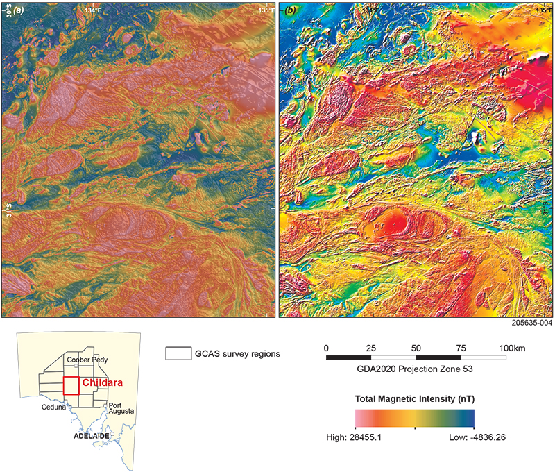
The most common way to display a digital image is through an additive combination of primary colours, red, green and blue. This is the RGB colour model, and it happens to be inadequate for representing TMI data (Fig 2). It simply does not have enough variation between adjacent colours to display the broad, continuous spectrum of frequencies that define the geomagnetic signal (Cowan and Dentith 2003).
Figure 2 Comparison of RGB (a) and HSV (b) enhanced images for the Childara region of the Gawler Craton. The images have identical colour map, contrast and hill-shading parameters. Long-wavelength variations are well represented in each, but the additive combination of colour and hill-shading gives the RGB image a ‘washed out’ look. In contrast, the HSV image retains its vibrancy through a multiplicative combination of colour and hill-shading. It is in the short-wavelength end of the spectrum that the HSV image clearly outperforms the RGB image, as edges, faults and fractures are more distinct against the backdrop of the colour-coded long-wavelength variation.
A better approach is the HSV colour model (Milligan et al. 1992). It can be thought of as a 3D colour space that combines red, green and blue primary additives, or hues, with spectral purity and colour intensity, referred to as saturation and value, respectively. The latter 2 dimensions create the appearance of illumination and shade that models natural light falling over a topographic surface.
The upshot is that the HSV model represents colour and shading as they appear to the human eye in the physical world. I will leverage this quality by storing long-wavelength information in primary colour combinations and short-wavelength information in shaded-relief.
For hard copy printing, a subtractive model based on primary colours cyan, magenta, yellow and black (CMYK) can preserve the desired features of HSV-enhanced images. All 3 models are mathematically related and can be easily converted from one to the other using 3-band image data.
Image enhancement applied to the GCAS aeromagnetic data
The enhancement procedure presented here was undertaken using the ER Mapper software. The underlying grid to which the procedure was applied is taken from Katona et al. (2021).
Processing steps
The corrected grid is first converted to double-precision, floating-point format. This allows the enhancement process to retain the original data precision.
Two products are derived from this double-precision grid: a shaded-relief image produced by a sun-angle kernel whose direction of artificial illumination is perpendicular to the region’s dominant geological fabric; and a histogram equalised grid of the TMI values. Shaded relief must be applied using the kernel function rather than the real-time shading function, which degrades the grid’s resolution. Values for both grids are scaled within the range 0–255.
Note that there are 2 dominant fabrics across the GCAS region: the Christie and Fowler domains to the northwest and the Gairdner Dolerite dykes to the northeast. Both are defined by broad arcuate fabrics, but the former has a NE–SW strike while the latter has a NW–SE strike. I therefore created 2 shaded-relief images perpendicular to each trend that fed into the 2 final enhanced images.
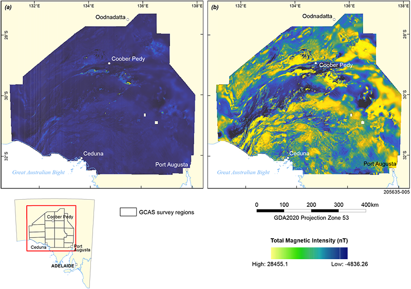
Histogram equalisation ensures that the TMI grid values are equally divided across the available (256) colour levels. This translates visually to each colour occupying an equal area of the image, and it comes with an advantage over linear colour mappings: enhanced colour resolution for densely populated intensity intervals. The trade-off is that degrees of change in colour will not map one-to-one with degrees of change in data values.
The logic of accepting such a trade-off is made clear in Figure 3. In this comparison of linear to non-linear (histogram equalised) colour mappings, the greediness of extreme values is on display: for the linear colour mapping, anomalous highs and lows eat up the colour bandwidth, obscuring real variation in the data that occurs on a local scale. Still, it is vital to keep in mind the true variation in the data when making interpretations, hence I provide both colour mappings in this release.
Figure 3 A comparison between linear (a) and non-linear (b) colour mapping shows how extreme values dominate the colour bandwidth in the former case. Note that to demonstrate the effect of non-linear colour mapping in isolation, I use the linear and perceptually uniform colour map, CET-L20 (Kovesi 2015).
The colour map used to display the TMI grid for the enhanced image is Peter Kovesi’s CET-RE1 (Kovesi 2015), a perceptually uniform rainbow colour map ranging from blue for low values to magenta for high values. Such colour maps are often avoided for their perceptual flat spots. That is, where reversals in the lightness gradient at yellow and red can distort a viewer's perceptual ordering of colour. But they remain attractive where the purpose of data display is to differentiate data values, rather than communicate data ordering, which is typically the case with geological interpretation.
The shaded relief grid is divided into 2 components: values above, and values below, the data’s histogram peak. Output values above the histogram peak are scaled between 127 and 255, while those below the histogram peak are scaled between 0 and 127. This divides the colour shading into light and dark portions, respectively, of equal range. Each component is saved as a separate ER Mapper algorithm file (.alg) with a linear transform applied. The sign of each linear transform is adjusted to ensure that darkening occurs towards the histogram tail and whitening occurs towards the histogram peak.
The TMI and shaded relief grids are then combined to create the final image. An empty ER Mapper file is created with the surface set to ‘HSV’. To obtain the desired colour contrast, ER Mapper’s ‘RGB to HUE’ formula is applied to the hue field, which is then populated by the colour TMI grid. The saturation and value fields are modulated by the 2 components of the shaded relief grid by direct substitution. The saturation field takes the light end of the spectrum, and the value field takes the dark end of the spectrum. Histogram equalisation is applied to both fields if further contrast is desired.
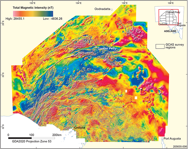
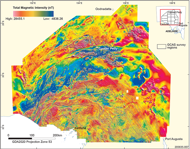
The resulting HSV-enhanced image (Figs 4, 5) has several qualities:
- Colour appears as it would under natural light in physical world.
- Colour resolution is sufficient to clearly differentiate subtle variations in data values.
- The broad, continuous frequency spectrum of aeromagnetic data is adequately captured, where combinations of the primary colours show long-wavelength information while changes in shaded relief show short-wavelength information.
- Colours brighten on the slopes of anomalies that face the illumination direction and darken on the face that opposes the illumination direction.
Figure 4 Enhanced TMI image of the GCAS dataset using the HSV colour model. Sun-shading is applied from the northwest, perpendicular to the strike of the broad magnetic fabric that defines the Christie and Fowler domains.
Figure 5 A second enhanced TMI image of the GCAS dataset using the HSV colour model, identical to that in Figure 4 except that sun-shading is applied from the northeast, perpendicular to the strike of the Gairdner Dolerite dykes.
Summary
Displaying aeromagnetic data using the HSV colour model can effectively display the long- and short-wavelength information captured by GCAS in a way that reflects colour as it is perceived under natural light. Although I have attempted to optimise for both the bold and subtle magnetic fabric across the Gawler Craton in a single image, any particular enhancement represents an inherent trade-off. Therefore, the images presented here are intended to complement existing derivative products (Katona et al. 2021). The images will serve a new geological interpretation of the Gawler Craton under the South Australian Discovery Mapping project.
Appendix (digital)
Zip file of HSV enhanced TMI image data (982 MB).
Acknowledgements
I dedicate this article to Peter Milligan, in acknowledgement of the stimulating effect his images of the magnetic grid of Australia had on my work, and the attentive mentoring he offered me when I started out in geophysics. Thanks to Mark Pawley (Geological Survey of South Australia, GSSA) for careful comments on an early version of this work. This article benefited from reviews by Philip Heath and Gary Reed (GSSA).
References
Milligan PR, Morse MP and Rajagopalan S 1992. Pixel map preparation using the HSV colour model. Exploration Geophysics 23(1–2):219–223. doi:10.1071/EG992219.


